How to choose 3 primary colours for a limited watercolour palette
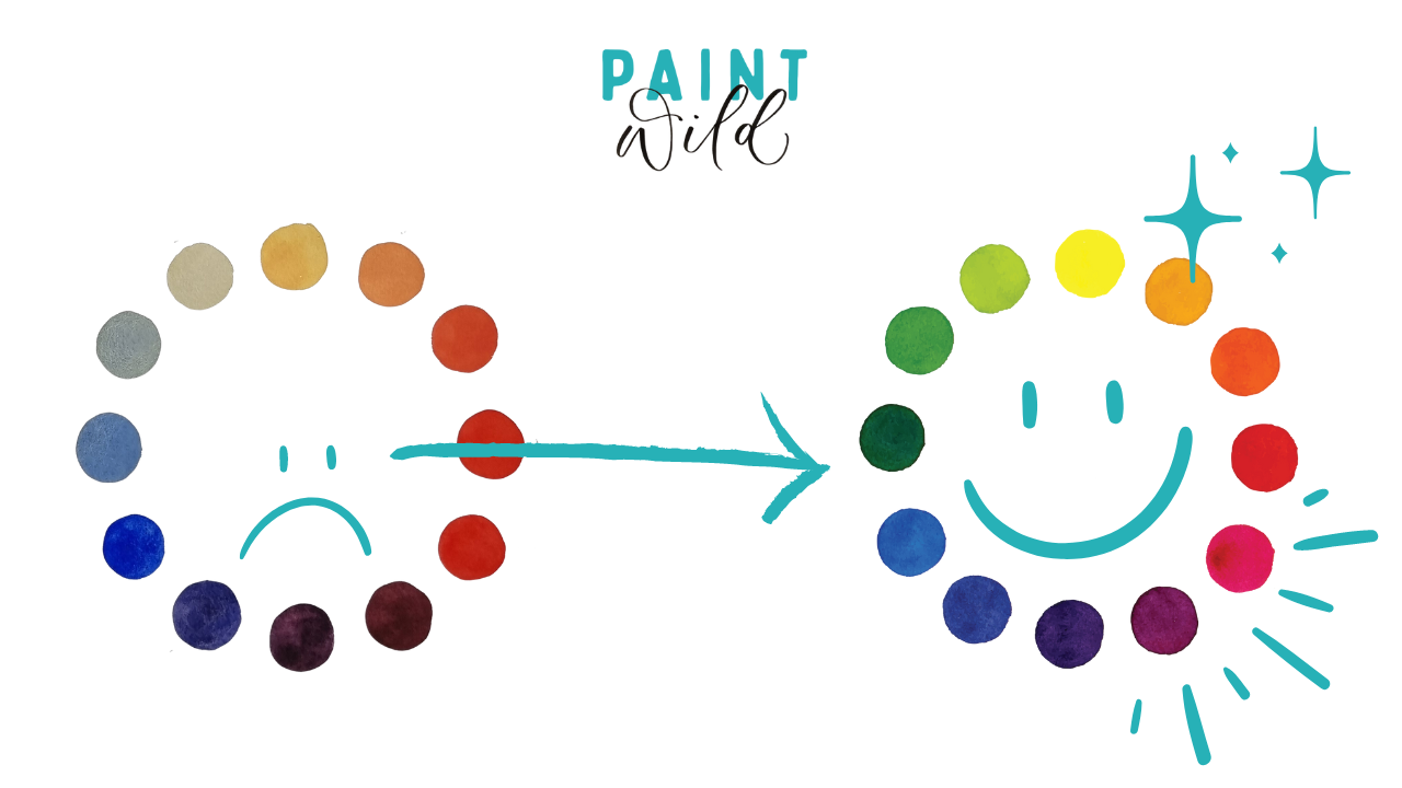
Have you been trying your hand at colour mixing, only to end up with mixes that are the exact shade of stinky bin sludge? Read on to see how the choice of your yellow, red and blue can impact the rest of your mixes!
When it comes to choosing 3 primary colours for your limited watercolour palette, it’s not just as simple as grabbing a yellow, red and blue off the shelf at your favourite art store.
You’ll want to think about the subjects you paint, the colours you need, and the individual properties of each colour.
Not all watercolours are created equal! Some colours are actually made up of multiple pigments (which can create muddy mixtures or produce unreliable results when they interact with other colours) some are opaque, some are staining, others granulate and others may have poor lightfastness meaning they fade or change colour over time (boooo!)
I wanna show you examples of 2 colour wheels where I’ve mixed 12 colours from different sets of primaries, so you can see for yourself just how different the results can be!
Now, this isn’t to say that one option is the best! Like I mentioned - you want to think about YOUR needs.
The first colour wheel is with a random yellow, red and blue I dug out of my collection of tubes. The second is made up of colours I use every day, specifically chosen to give me what I want.
Colour wheel 1: Naples Yellow, Scarlet Lake, French Ultramarine (Winsor and Newton)
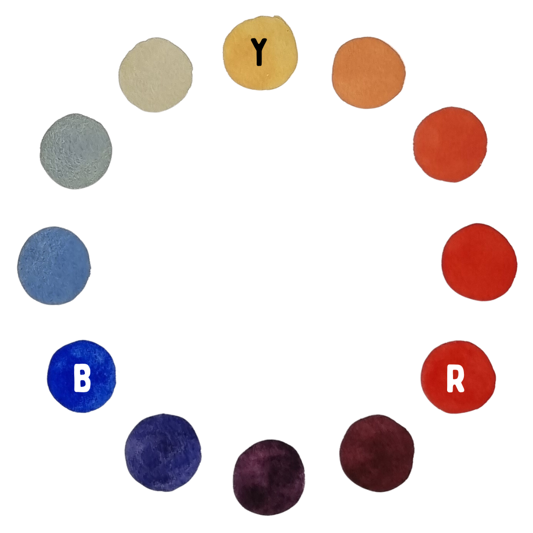
- Naples Yellow: PBr24, PW6
- Scarlet Lake: PR188
- French Ultramarine: PB29
These 3 colours here are definitely not ones I personally would like to work with. But they might be perfect for someone who prefers more muted tones!
What I discovered:
- Naples Yellow is made up of 2 pigments, and one of those is Titanium White. This gave the colour opacity
- Naples Yellow is a pink-warm-yellow, and it created peachy oranges with Scarlet Lake
- Scarlet Lake is a staining colour, it is very strong and dominated the mix with Naples Yellow
- French Ultramarine makes 3 from 3 in terms of ‘warm colours’ (temperature is relative, however) and it made muted milky green mixes with Naples Yellow, and dull muddy purples with Scarlet Lake
- French Ultramarine is also a granulating colour, meaning the pigment particles weigh more than the water they’re suspended in, and they sink to the bottom of the paper and settle there. It leaves a cracked look when it dries - and every colour I mixed with it ended up with that effect. You can even see some of the blue separating in the mixes
Now, let’s compare it to another set of primaries.
As well as being a painter, I’m a paint maker too, so this wheel is made from my aptly named primary colours: Primary Yellow, Primary ‘Red’, and Primary Blue (Paint Wild range)
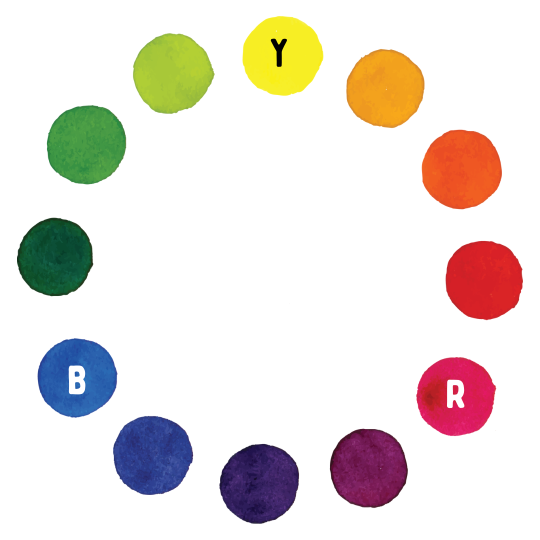
- Yellow: PY74
- ‘Red’: PR122 (commonly known as Quinacridone Magenta)
- Blue: PB15:3 (commonly known as Phthalo Blue)
You might be wondering from that list above, Why is the red written ‘Red’? Is it FAKE RED? Why is it commonly known as Quinacridone Magenta? Which is it, lady? And also how do you say Phthalo Blue without making a raspberry sound with your mouth? That’s because it’s not reaaaally red! Oh, and it’s pronounced ‘thay-low’ ;)
I subscribe to a modern colour wheel of a yellow, magenta and cyan. Just like a printer! I find that these give me the widest range of vibrant colours. And despite what we were all taught about the primary colours, you CAN mix red! Magenta + Yellow will give you a lovely red (which you can see on this wheel in the place of ‘red orange’ - the one above the R circle)
It might be hard to believe by looking at them, but I paint ALL my wildlife portraits with these. Yep, aaaaaaall those brown animals too.
Remember, it’s all based on your preferences and needs! Here are mine:
- Bright, saturated colours - that I then have the choice to water down
- Ability to mix a wide variety of 12 colours - none that look too similar or are too tricky to differentiate
- The ability to mix complements of one another to make muddy neutrals if I want
- No special effects like granulation or opacity - I want the option to add these if I feel like it
So as you can tell, I love choice! I don’t want my palette to make me feel restricted. That might sound silly because I work with a limited palette - so how is that NOT restrictive? Well, I love the simplicity of starting with just 3 colours, it reduces my overwhelm. But I have the option to do so much more with them!
Tips for choosing primary colours for your own limited palette:
- Think about the subjects you paint most, and what colour palette they call for
- Check to see if any of the primaries you’re interested in are single pigment or not (you can usually check the back of the tube or packet, look for the codes like I listed above. P for pigment, then Y for yellow etc, and numbers. One code = single pigment). The more pigments in one colour, the more likely it'll get muddy when you mix it with others
- Check to see what characteristics each colour has. Do they granulate? Are they staining? Are they opaque, transparent, or semi? Do any of these things matter to you and would they positively or negatively affect the colour mixes you need?
- Check their lightfastness rating (how likely they are to fade or change colour with time)
- Check the temperature of your primaries (thermometer not required) - temperature is all relative of course, but if you have a couple versions of a yellow, red and blue, try swapping in a cooler or warmer version one at a time, to see what results you get. Some people prefer having a split primary palette of 6 colours, a warm and cool version of each, to give them the most range
- Still got no idea where to start? Google the brand you want to use + 'recommended primaries' - a lot of them will list their best combos on their website :)
I personally look for transparent colours, with no characteristics, that follow that cyan, magenta and yellow model. A pretty intense and neutral yellow, a magenta-red, and a more of a greeny-blue.
But these colour wheels are just 2 examples! There are sooooo many possibilities of colour wheels you could create, simply by swapping out one colour at a time. I encourage you to experiment with an open mind, because some colour combinations will surprise you.
If you’ve been struggling with muted or muddy colours, perhaps it’s one (or all) of the primaries you’re mixing with that are the problem, NOT your mixing skills.
If you'd like to become a pro at colour mixing, check out my free course Wild Colours, where I'll teach you how to make a colour wheel of your own, a glazing chart with 144 colour combinations, and use them to paint a beautiful realistic tiger's eye.
Happy mixing!
Emma
